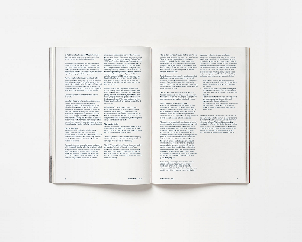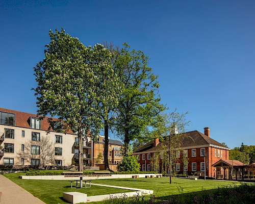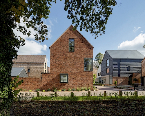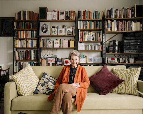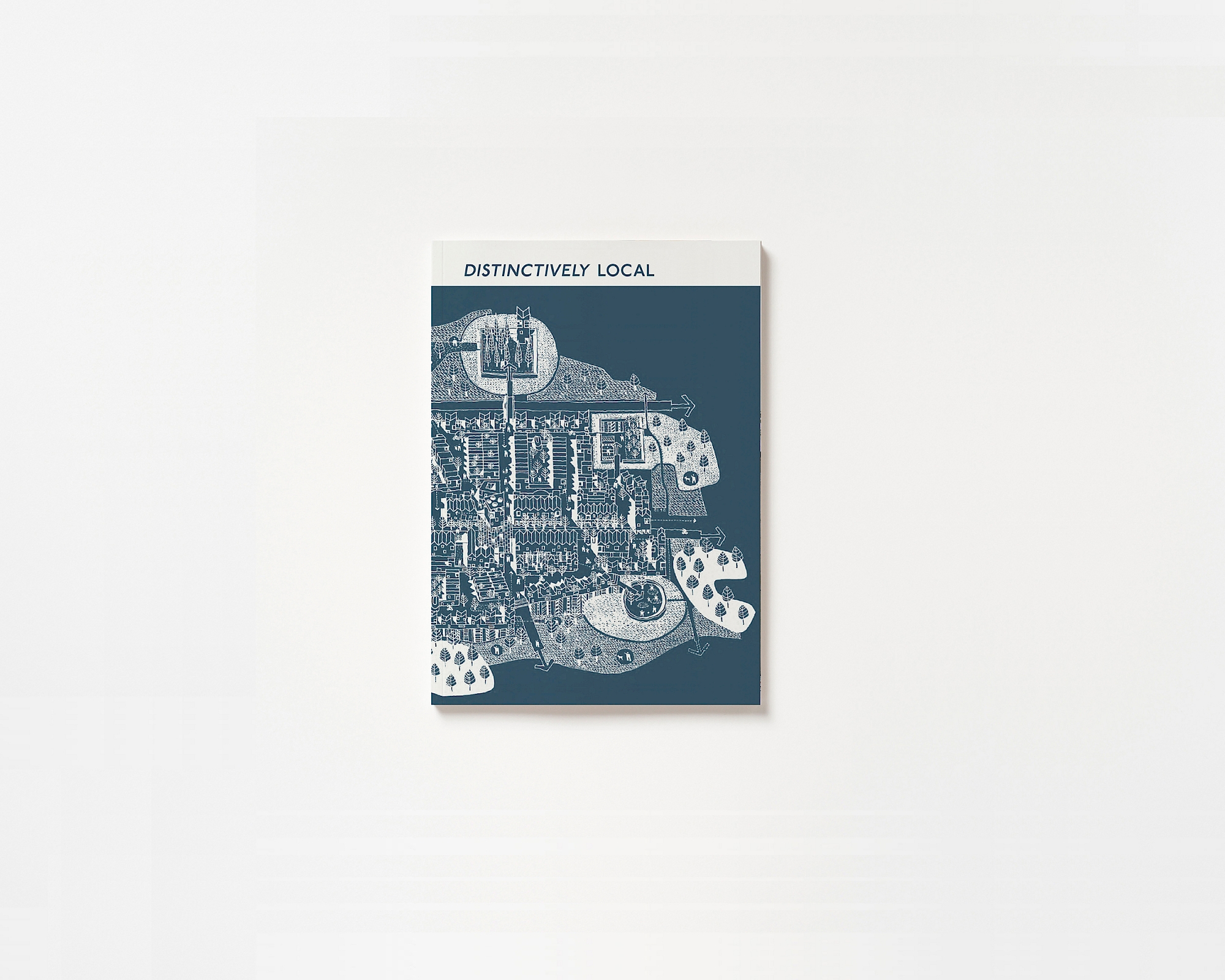
Continuing our collaboration with HTA Design, Proctor and Mathews and PRP architects, PTE designed and art directed Distinctively Local, the report which demonstrates how we can boost housing supply whilst creating beautiful and popular places.
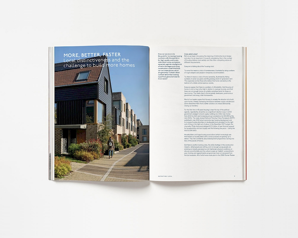
The publication responds directly and positively to (former) Housing Minister Kit Malthouse’s recent challenge to architects to who challenged architects to create great homes and communities, and provides guidance and case studies for creating genuinely distinctive and popular places. By blurring the boundaries between architecture discourse and art publications, our design for Distinctively Local draws upon low-fi retro catalogues, invoking the darker atmosphere of a manifesto. The typographic design features the London Underground font, referencing the concept and planning ideas of Metro-land; the idyllic marketing name given to suburban homes served by the Metropolitan line.
