PTE launches new website

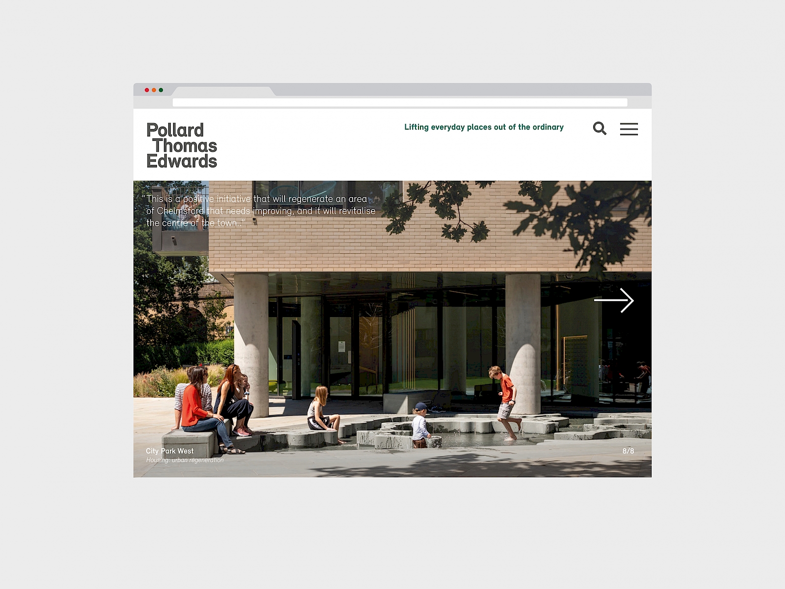
The communications team has redesigned PTE’s website as part of a comprehensive brand revamp. With a fresh look and interface that encourages browsing, it showcases compelling new content including photography and films of some of PTE’s latest projects.
The enhanced online experience is designed to raise PTE’s practice profile and presence, as the industry increasingly meets and does business online. Optimised for both mobile and desktop use, it features more video, a section on social value and an opinions page that all PTE staff can contribute to.
“The website has a democratic feel, with new portraits and full bios of everyone who works here. It’s more user-friendly too because of how we’ve structured the pages and the editorial.” says PTE’s graphic designer Nikos Georgopoulos. “Anyone should be able to navigate it without difficulty and easily find the information they are looking for.” One detail Nikos picks out is the colour block which kicks in when you select text anywhere on the website. “The highlight colour changes every day, using PTE’s brand colours,” he adds.
The website now publishes maxims, such as “Every 'unit' will be someone's home” and “Create more with less” at the top of the screen every time a page is refreshed or a new page is visited. “By presenting our brand statements online, we’re putting them centre stage, creating a dialogue between our company values and the buildings we design,” says partner Carl Vann. The effect is of a website designed to synchronise with and enhance PTE’s studio brand and inspire colleagues, clients and collaborators.
The revamp is part of a wider project the comms team – PTE’s writers, editors and graphic designers - is undertaking, to update the practice brand. “Using a revised style guide, we are creating templates, from staff bios to project publicity sheets, for 2020 and beyond,” says associate partner and comms manager Tim Metcalfe.
Tim explains that by adopting a more integrated approach that encompasses a complementary editorial and graphic design approach, the comms team, is able to more usefully serve the five architectural workshops with stylish, appropriate tools, such as Design & Access report templates and consultation material.
The overhaul also anticipates further developments to come, including the official launch of Knowledge Hub and PTE’s bespoke publishing and branding service.


